Clone Twitter's Front End Part I

NOTE: This post was originally created as a lesson for my high school students. The target audience is beginners to web development.
Twitter’s role in modern society can’t be understated. Anyone with anything to say gets an opportunity to be heard. Just find a device with access to the Internet and type up to 140 characters into the tweet box. Click submit. Boom. You have a voice.
Simple concepts that are surprisingly powerful always amaze me, and the tweet is a prime example. And it can’t be that hard to recreate, can it?
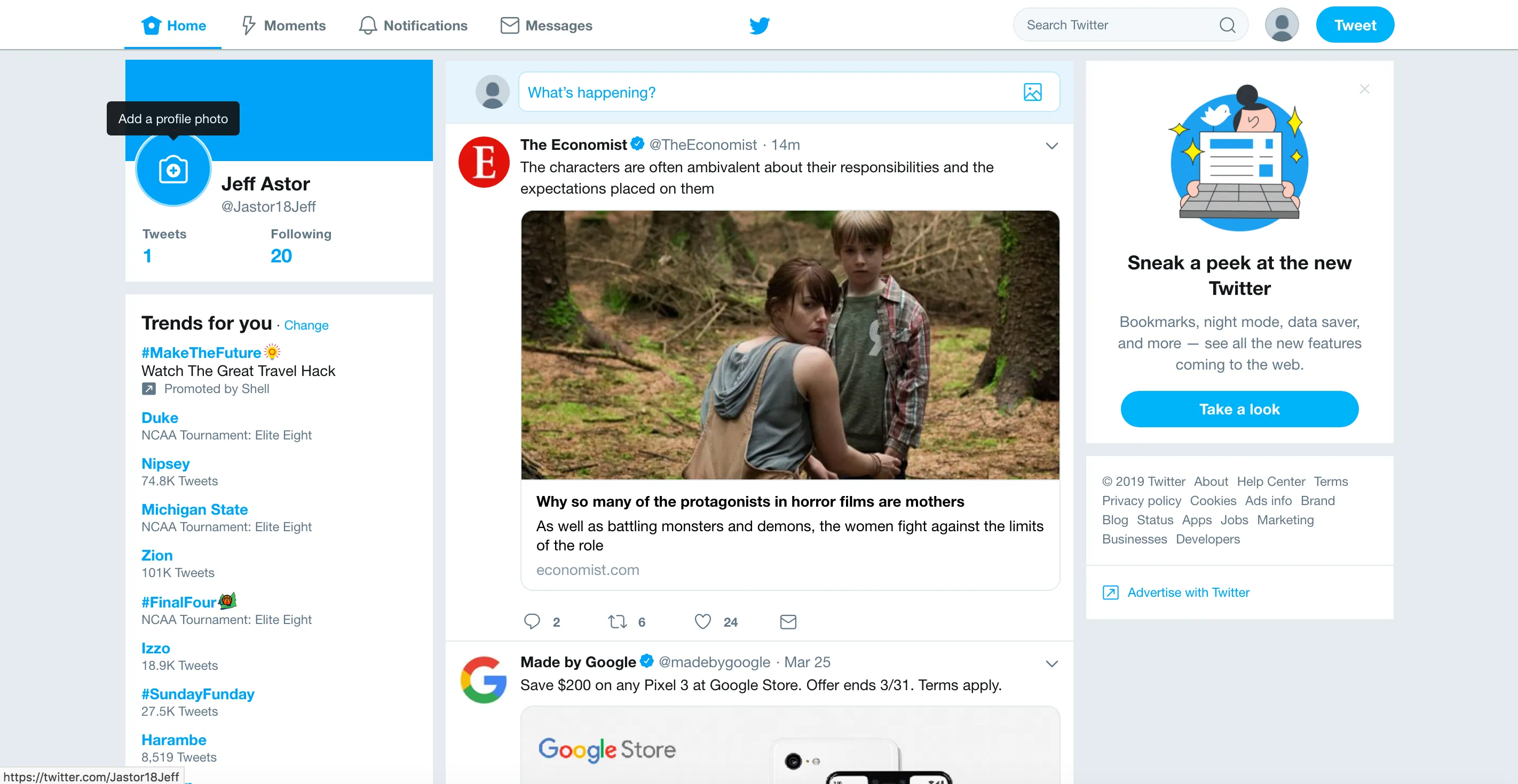
Let’s do that here. We’ll build out a simplified Twitter feed page that replicates how the application works on the front-end.
This screenshot will serve as our guide during the process.
Part 1 (this part) will deal with the markup. That is, we’ll write a bit of HTML and a lot of CSS. Part 2 will mix markup and JavaScript.
The Navbar
We’ll start with the fixed navbar component. Open up a new codepen or fork this one here and follow along.
All we’ve done here is layout some div elements that will hold most of the app content and add a bunch of CSS variables to the :root pseudo selector. If any of that is confusing to you, check out some of my earlier posts on building websites from scratch or on using CSS variables .
Start by adding the following code to your CSS section.
body {
  background: var(--color-twitter-bg);
  font-size: 14px;
}
.Twitter {
}
/*****************
      NAVBAR
*****************/
.navbar {
  position: fixed;
  top: 0;
  left: 0;
  right: 0;
  z-index: 1000;
  width: 100%;
  background: rgb(255, 255, 255);
  height: 50px;
  color: var(--color-font-secondary);
  border-bottom: 1px solid var(--color-nav-border);
  display: grid;
  grid-template-columns: repeat(12, 1fr);
  grid-template-areas: ". links links links . bird . . search search actions .";
}
/*****************
   NAVBAR LINKS
*****************/
.navbar .links {
  grid-area: links;
  display: flex;
  align-items: center;
}
We specify that the body should use the --color-twitter-bg CSS variable to color our main background, and that the base font-size should be 14px.
Giving the .navbar a fixed position, with top: 0, right: 0, left: 0, and z-index ensures that it stays at the top of the screen and overlaps everything that moves under it. We use display: grid and create 12 columns of equal width. Then, we create a grid-template-areas property to specify how much space each section should take up.
The .links section is be given a grid-area name equal to ‘links’ and uses flexbox to position the elements inside of it.
If you don’t understand any of this part, check out one of my previous posts on CSS grid and CSS flexbox
To see our results in action, add add some HTML and icons to the navbar.
<div class="navbar">
  <ul class="links">
    <li class="active">
      <i class="fas fa-home"></i>
      <span> Home</span>
    </li>
    <li>
      <i class="fas fa-bolt"></i>
      <span> Moments</span>
    </li>
    <li>
      <i class="far fa-bell"></i>
      <span> Notifications</span>
    </li>
    <li>
      <i class="far fa-envelope"></i>
      <span> Messages</span>
    </li>
  </ul>

  <div class="bird">
    <i class="fab fa-twitter"></i>
  </div>

  <div class="search">
    <input placeholder="Search Twitter" />
    <i class="fas fa-search"></i>
  </div>

  <div class="actions">
    <span class="avatar fa-stack flex-v-center">
      <i class="fas fa-circle fa-stack-2x">
        <i class="fas fa-user fa-stack-1x"></i>
      </i>
    </span>

    <button>Tweet</button>
  </div>
</div>
We’re making use of the font-awesome library to create icons in our HTML by using classes like fa-search, fa-bolt, and fa-user. We need to add the font-awesome css stylesheet to our file before the icons will actually appear. So refactor the code in between your head tags to look like this.
<head>
  <title>Twitter Clone</title>
  <link rel="stylesheet" href="https://use.fontawesome.com/releases/v5.8.1/css/all.css" crossorigin="anonymous" />
</head>
Now all of our icons should appear. We still have a little work to do.
Notice how each div has the class name equal to what we’ve specified in the grid-template-areas property of the .navbar? Make sure to add that information to your CSS section like so.
.navbar .bird {
  grid-area: bird;
}
.navbar .search {
  grid-area: search;
}
.navbar .actions {
  grid-area: actions;
}
The elements should now be positioned properly along the x-axis, but they’re not styled very well and look out of place. Let’s fix that now.
We’ll start by creating a css rule to vertically center every element.
.flex-v-center {
  display: flex;
  align-items: center;
}
After assigning that class to the .bird, .search, and .actions elements, we’re ready to start making things look nice.
We’ll start by working on our navbar links. Add the following css to your file.
.navbar .links li {
  flex: 1;
  height: 49px;
  cursor: pointer;
  padding: 0px 10px;
  display: flex;
  align-items: center;
  justify-content: center;
  color: var(--color-font-secondary);
  border-bottom: solid 2px transparent;
  transition: all 0.2s ease;
}
.navbar .links li i {
  font-size: 18px;
  margin-right: 5px;
}
Let’s take a sneak peek to see how it looks (telling the bird, search, and actions sections not to display).
Wow. That made a big difference. We told each <li> inside our .links list to have a flex of 1. This tells the list items to take up all the available space inside the list, and share it equally. The minimum size of each <li> is set to 1/4 the size of the </ul>.
We make the list items 49px tall and set their border-bottom to solid 2px transparent. This will take up all 50px of the navbar and 1 extra pixel. It will also provide a nice transition effect when we add color to the border in a second. We finish it off with transition: all 0.2s ease so that all animations will have a 200ms delay (200ms is 2/10 of 1 second) and look smooth.
Add the following to your css to see that colored effect happen.
.navbar .links li.active,
.navbar .links li:hover {
  color: var(--color-twitter-blue);
  border-bottom: solid 2px var(--color-twitter-blue);
}
This chunk of code tells any list items with a class of .active or any list item that is hovered over should have a color and border-bottom equal to the Twitter blue color we defined earlier.
If you look carefully at Twitter’s home page, you’ll see there’s a tiny dot above the active link also. We’ll implement that like so:
.navbar .links li.active span::before {
  content: "";
  width: 5px;
  height: 5px;
  border-radius: 50%;
  position: absolute;
  top: 10px;
  margin-left: -3vw;
  background: var(--color-twitter-blue);
}
Though this isn’t always the best way to accomplish this, it is good to know how to use the ::before and ::after pseudo-selectors.
That weird ::before selector is a pseudo-selector that is applied to the span nested inside of the <li> with an active class. It basically creates a <div> before the span that is a 5px radius circle with the background of twitter blue. We position it absolutely to take it out of the flow of the page and move it 10px from the top of the navbar.
Mozilla outlines the ::before pseudo-selector here.
In CSS, ::before creates a pseudo-element that is the first child of the selected element. It is often used to add cosmetic content to an element with the content property. It is inline by default.
The example they give is this one:
/* Add a heart before links */
a::before {
  content: "♥";
}
I don’t know how often we’d want to put a heart before all links, but hey, at least we know!
With all those additions, our navbar should now look like the following codepen.
Let’s finish up the rest of this navbar real quick.
Throw the rest of this css into your page to complete the navbar.
/*****************
   NAVBAR ICON
*****************/
.navbar .bird {
  grid-area: bird;
  font-size: 20px;
  margin-left: 30px;
}
.navbar .bird i {
  color: var(--color-twitter-blue);
}

/*****************
   NAVBAR SEARCH
*****************/
.navbar .search {
  grid-area: search;
}
.navbar .search input {
  width: 100%;
  padding: 8px 12px;
  border-radius: 20px;
  border: solid 1px var(--color-twitter-mid-gray);
  background: var(--color-twitter-light-gray);
  transition: all 0.2s ease;
}
.navbar .search input:focus {
  outline: none;
  background: white;
  border: solid 2px var(--color-twitter-blue);
}
.navbar .search i {
  transform: translateX(-25px);
  color: var(--color-twitter-dark-gray);
}

/******************
   NAVBAR ACTIONS
*******************/
.navbar .actions {
  grid-area: actions;
}
.navbar .actions .avatar {
  display: flex;
}
.navbar .actions i.fa-circle {
  color: var(--color-twitter-mid-gray);
  font-size: 35px;
  display: flex;
  justify-content: center;
  align-items: center;
  overflow: hidden;
  border-radius: 50%;
}
.navbar .actions i.fa-user {
  color: var(--color-twitter-dark-gray);
  font-size: 24px;
  transform: translateY(6px);
}
.navbar .actions button {
  color: white;
  background: var(--color-twitter-blue);
  padding: 8px 12px;
  border-radius: 20px;
  margin-left: 10px;
  font-size: 16px;
}
Nothing super interesting here, other than how we made the .fa-circle icon hide the bottom part of the .fa-user icon. Because the user icon is nested in the circle icon, we tell the .fa-user to have transform: translateY(6px). This moves the user down 6px from its original position. The circle icon has a border-radius of 50% and it’s overflow set to hidden. Now, when the user icon moves beyond the outside of the circle, it is hidden. Lovely.
The rest is pretty standard.
To polish off the navbar, add the following media queries so that everything looks nicer when the width is minimized.
@media screen and (max-width: 1150px) {
  .navbar {
    padding: 0 20px;
    grid-template-areas: " links links links . . bird . search search search actions actions";
  }
}
@media screen and (max-width: 900px) {
  .navbar {
    grid-template-areas: "links links links links . . bird search search search actions actions";
  }
  .navbar .links li.active span::before {
    margin-left: -25px;
  }
}
@media screen and (max-width: 740px) {
  .navbar {
    grid-template-areas: "links links links links . . . . . . . bird";
  }
  .search,
  .actions {
    display: none;
  }
}
Showcasing the power of CSS grid, these rules guarantee that our navbar looks decent enough at different screen sizes.
Let’s check out our page one more time.
The Main Tweet Feed Section
Whew, we’re finally ready to create our Twitter feed page. Let’s add create the two outside columns first, and then fill out our tweet box and twitter feed.
Update your .main div to look like this:
<main class="main">
  <div class="col left-col">
    <div class="user-info">
      <div class="card-top"></div>
      <div class="card-mid">
        <span class="fa-stack ">
          <i class="fas fa-camera fa-stack-2x">
            <i class="fas fa-plus fa-stack-1x"></i>
          </i>
        </span>
        <div class="twitter-handle">
          <h3>Jeff Astor</h3>
          <p>@jastornaut</p>
        </div>
      </div>
      <div class="card-bottom">
        <p>Tweets</p>
        <p>Following</p>
        <h3>1</h3>
        <h3>20</h3>
      </div>
    </div>
  </div>

  <div class="col feed"></div>

  <div class="col right-col">
    <div class="advert">
      <img src="https://abs.twimg.com/a/1553555845/img/delight/delight_prompt_2.png" />
      <h3>Sneak a peak at the new Twitter</h3>
      <p>Bookmarks, night mode, data saver, and more — see all the new features coming to the web.</p>
      <button>Take a look</button>
    </div>
  </div>
</main>
and then add the following code to the bottom of your CSS section.
/******************
   MAIN SECTION
*******************/
.main {
  padding-top: 60px;
  display: grid;
  grid-template-columns: repeat(12, 1fr);
  grid-column-gap: 10px;
  grid-template-areas: ". left-col left-col left-col feed feed feed feed feed right-col right-col .";
}
.col {
}

/******************
   LEFT COLUMN
*******************/
.left-col {
  grid-area: left-col;
}
.left-col .user-info {
  background: white;
  height: 220px;
  margin-bottom: 10px;
  display: flex;
  flex-direction: column;
}
.left-col .user-info .card-top {
  flex: 1;
  background: var(--color-twitter-blue);
}
.left-col .user-info .card-mid {
  flex: 1;
  background: white;
  display: flex;
}
.left-col .card-mid .fa-stack {
  background: var(--color-twitter-blue);
  color: white;
  padding: 20px;
  border-radius: 50%;
  border: solid 3px white;
  margin-top: -30px;
  margin-left: 10px;
}
.left-col .card-mid .fa-plus {
  color: var(--color-twitter-blue);
  font-size: 8px;
  transform: translateY(11px);
}
.left-col .card-mid .twitter-handle {
  margin-top: 10px;
  margin-left: 10px;
  letter-spacing: 0.2px;
}
.left-col .card-mid .twitter-handle h3 {
  font-size: 18px;
  font-weight: 600;
  margin-bottom: 5px;
}
.left-col .card-mid .twitter-handle p {
  color: var(--color-twitter-dark-gray);
  font-weight: 400;
}
.left-col .card-bottom {
  width: 80%;
  height: 60px;
  margin: -20px 0px 0 10px;
  display: grid;
  grid-template-columns: 1fr 1fr;
  grid-template-rows: 1fr 1fr;
}
.left-col .card-bottom p {
  font-size: 14px;
  color: var(--color-twitter-dark-gray);
}
.left-col .card-bottom h3 {
  font-size: 20px;
  font-weight: bold;
  color: var(--color-twitter-blue);
  margin-top: -10px;
}

/******************
   RIGHT COLUMN
*******************/
.right-col {
  grid-area: right-col;
}
.right-col .advert {
  background: white;
  display: flex;
  flex-direction: column;
  align-items: center;
  padding: 15px 20px;
  text-align: center;
}
.right-col .advert img {
  height: 200px;
}
.right-col .advert h3 {
  font-size: 18px;
  font-weight: 500;
  margin: 5px 0 15px 0;
}
.right-col .advert p {
  font-weight: 300;
  margin: 0 0 15px 0;
}
.right-col .advert button {
  background: var(--color-twitter-blue);
  color: white;
  padding: 8px 12px;
  width: 100%;
  font-size: 15px;
  border-radius: 20px;
}
This is all standard HTML and CSS with an added pinch of CSS flexbox and CSS grid. Make sure to also update the media queries for nicer displays on different sized screens.
/**************
  MEDIA QUERIES
***************/
@media screen and (max-width: 1150px) {
  .navbar {
    padding: 0 20px;
    grid-template-areas: " links links links . . bird . search search search actions actions";
  }
  .main {
    padding: 60px 20px;
    grid-template-areas: "left-col left-col left-col feed feed feed feed feed feed right-col right-col right-col";
  }
}
@media screen and (max-width: 900px) {
  .navbar {
    grid-template-areas: "links links links links . . bird search search search actions actions";
  }
  .main {
    padding: 60px 20px;
    grid-template-areas: "left-col left-col left-col feed feed feed feed feed feed right-col right-col right-col";
  }
}
@media screen and (max-width: 740px) {
  .navbar {
    grid-template-areas: "links links links links . . . . . . . bird";
  }
  .search,
  .actions {
    display: none;
  }
  .main {
    padding: 60px 20px;
    grid-template-areas: "left-col left-col left-col left-col left-col left-col right-col right-col right-col right-col right-col";
  }
}
With all that code, we finally get to something like this codepen.
Not looking half bad. We’ll fix those media queries when we add the feed in to make things look nicer.
That’s more than enough code for one day. Let’s save the tweet box and feed until the next post.
Wrapping Up and Resources
Our halftime result isn’t anything to scoff at. It took more code than I originally thought it would, and there’s definitely room for improvement. Still, we’re almost at a working prototype and we’re ready to make our site interactive.
- Twitter’s Mobile Technology Stack - An article discussing how Twitter relies on Node.js, Express.js, and React to create their mobile app. https://www.infoq.com/news/2017/02/twitter-react-mobile-stack
- Twitter Engineering Blog - The Infrastructure Behind Twitter Scale is a cool article showing how Twitter deals with the enormous amount of data they handle each day. https://blog.twitter.com/engineering/en_us/topics/infrastructure/2017/the-infrastructure-behind-twitter-scale.html
- Quora - Twitter’s tech stack. https://www.quora.com/What-is-the-technology-stack-behind-Twitter